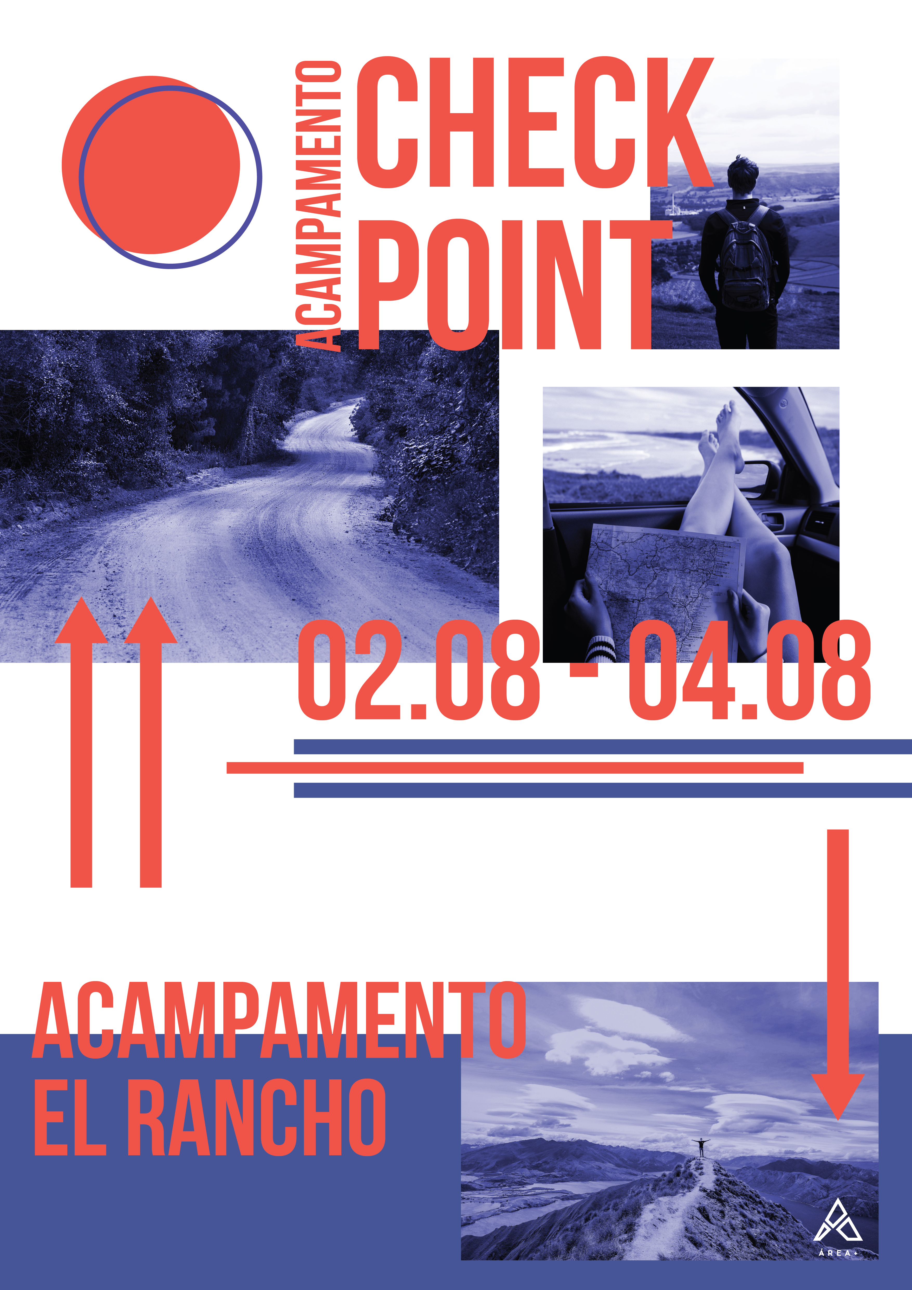
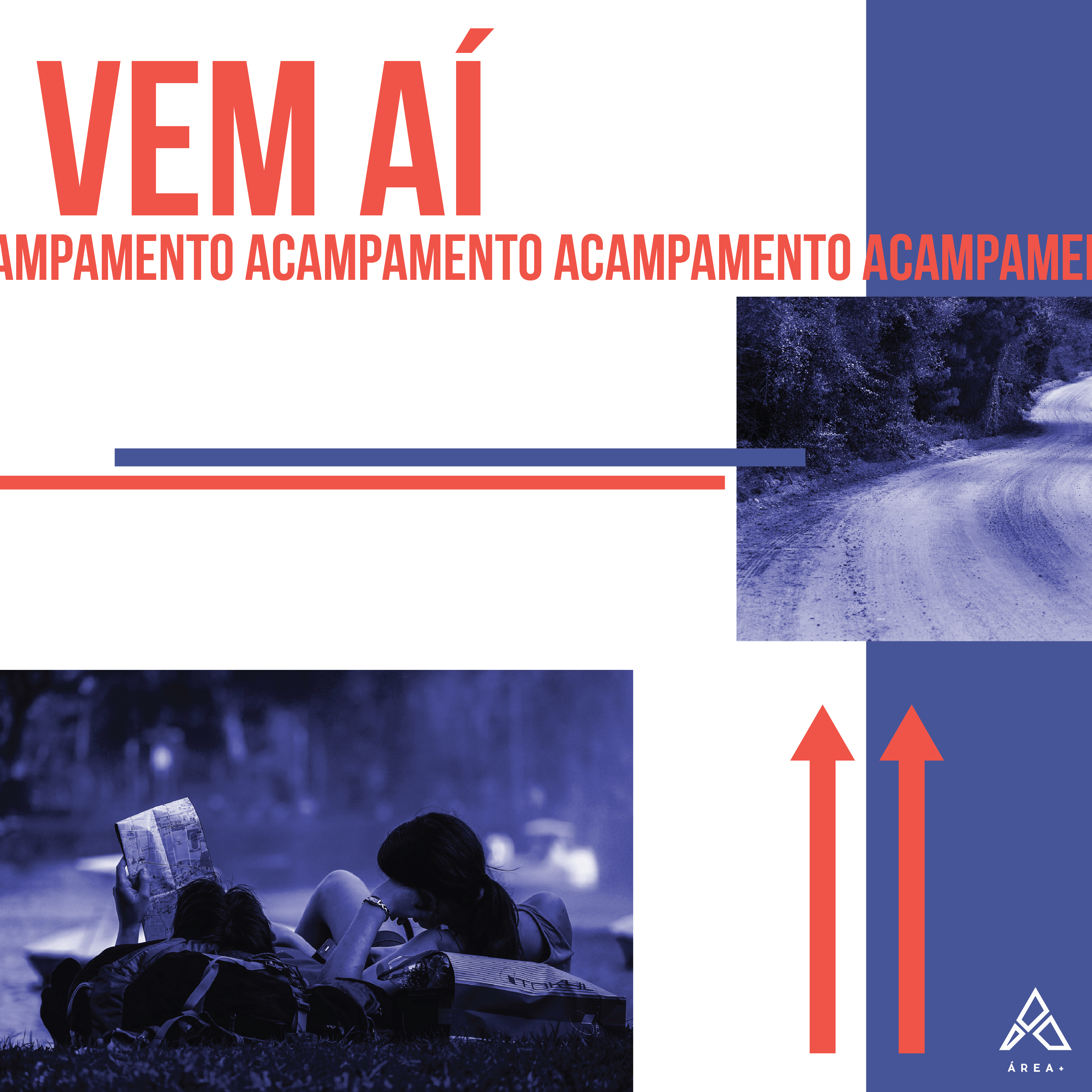
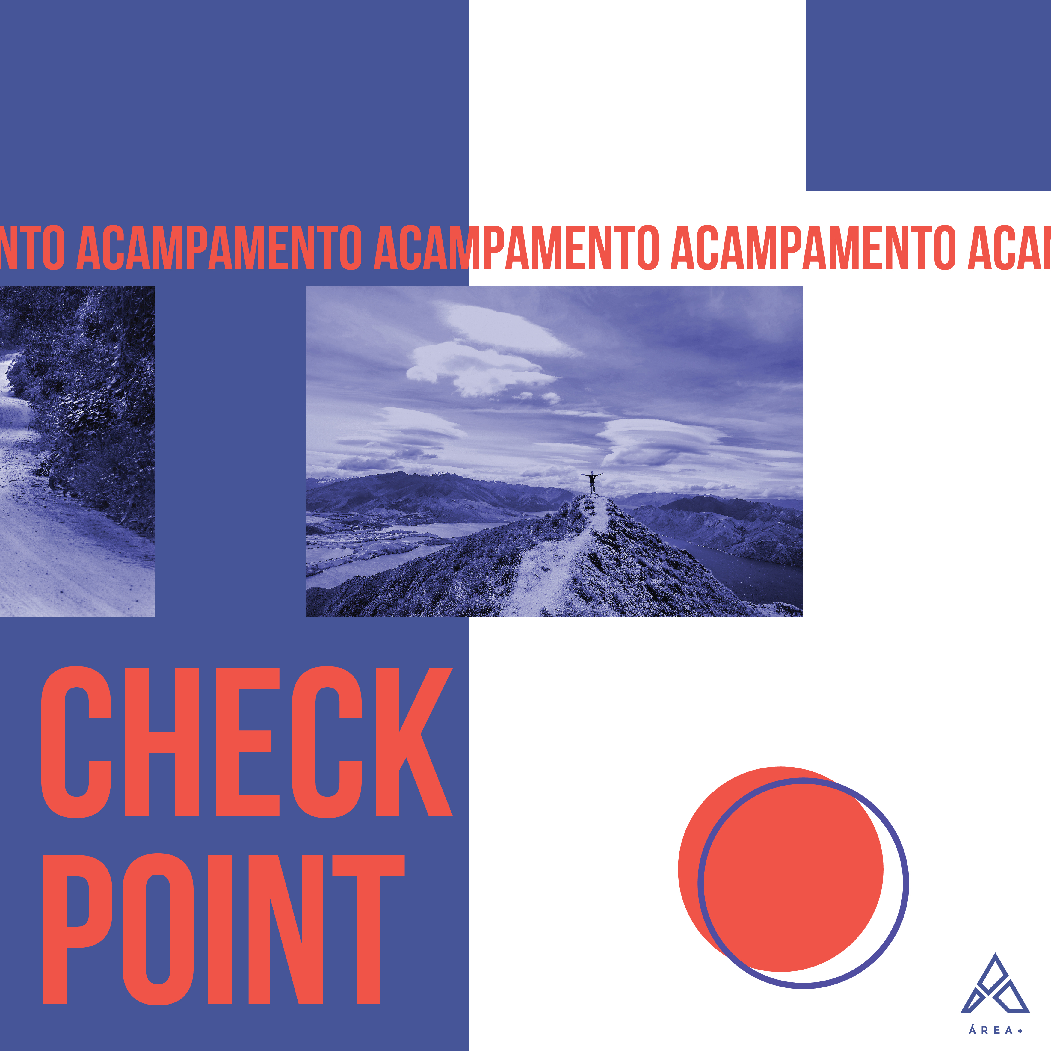
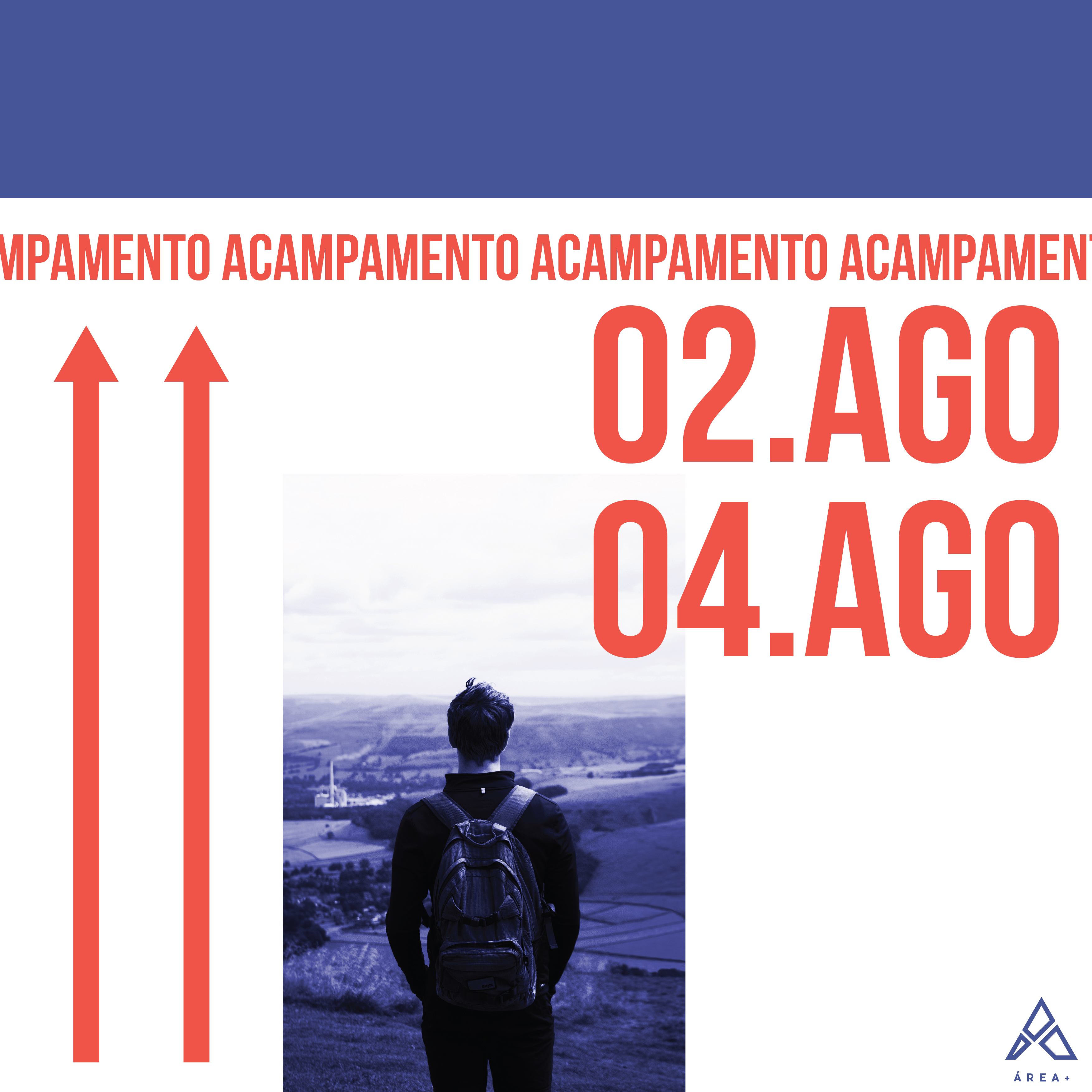
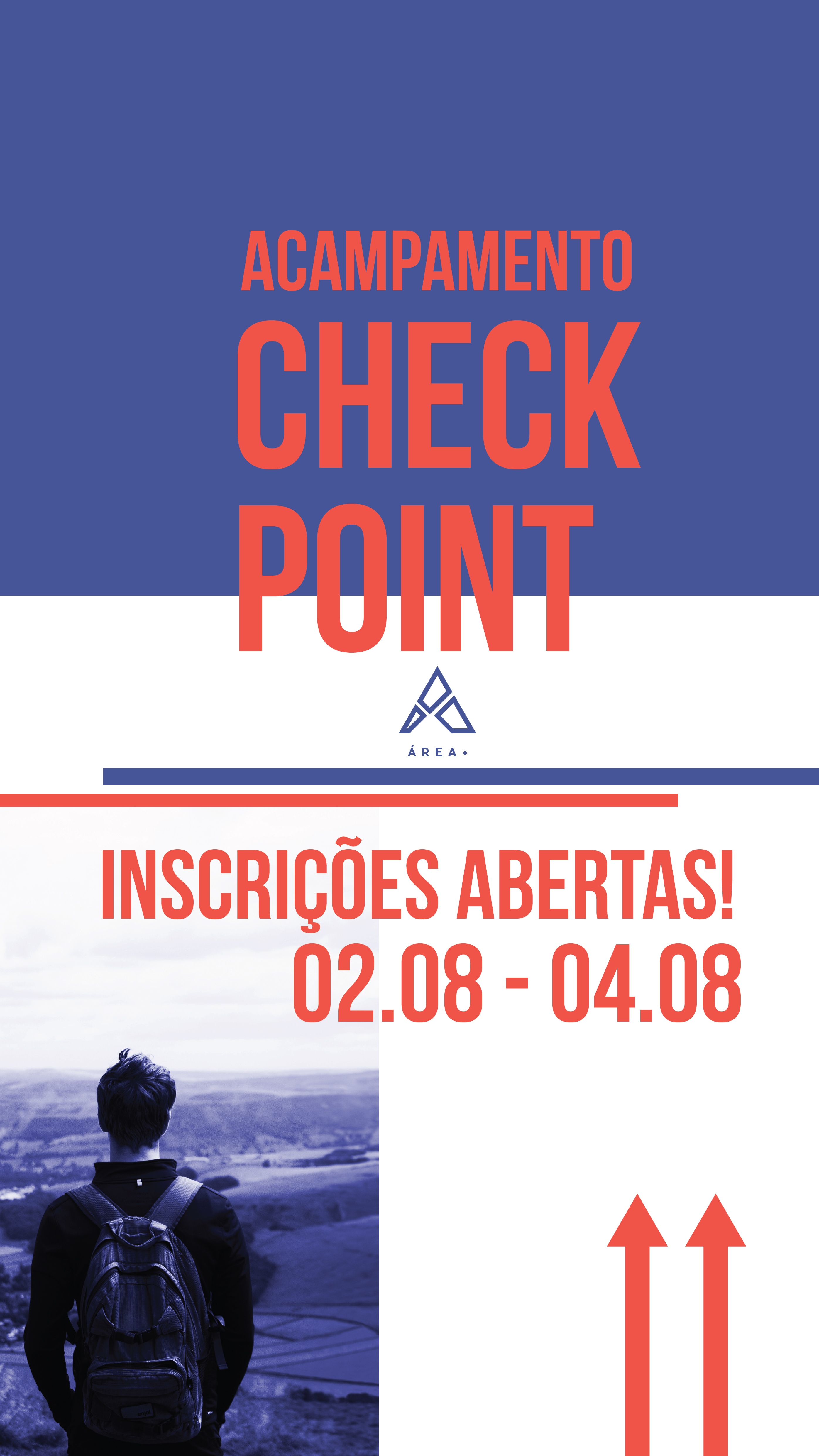
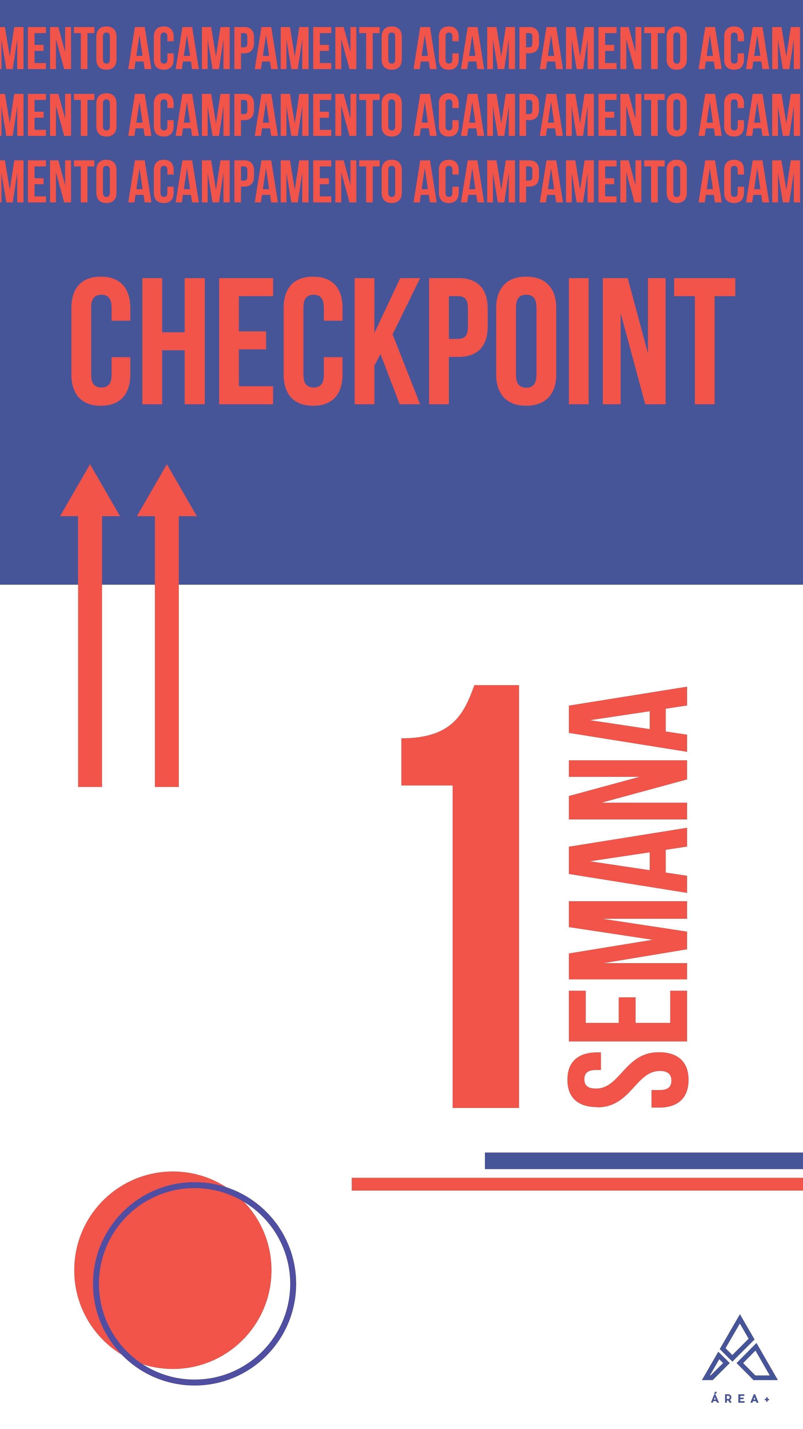
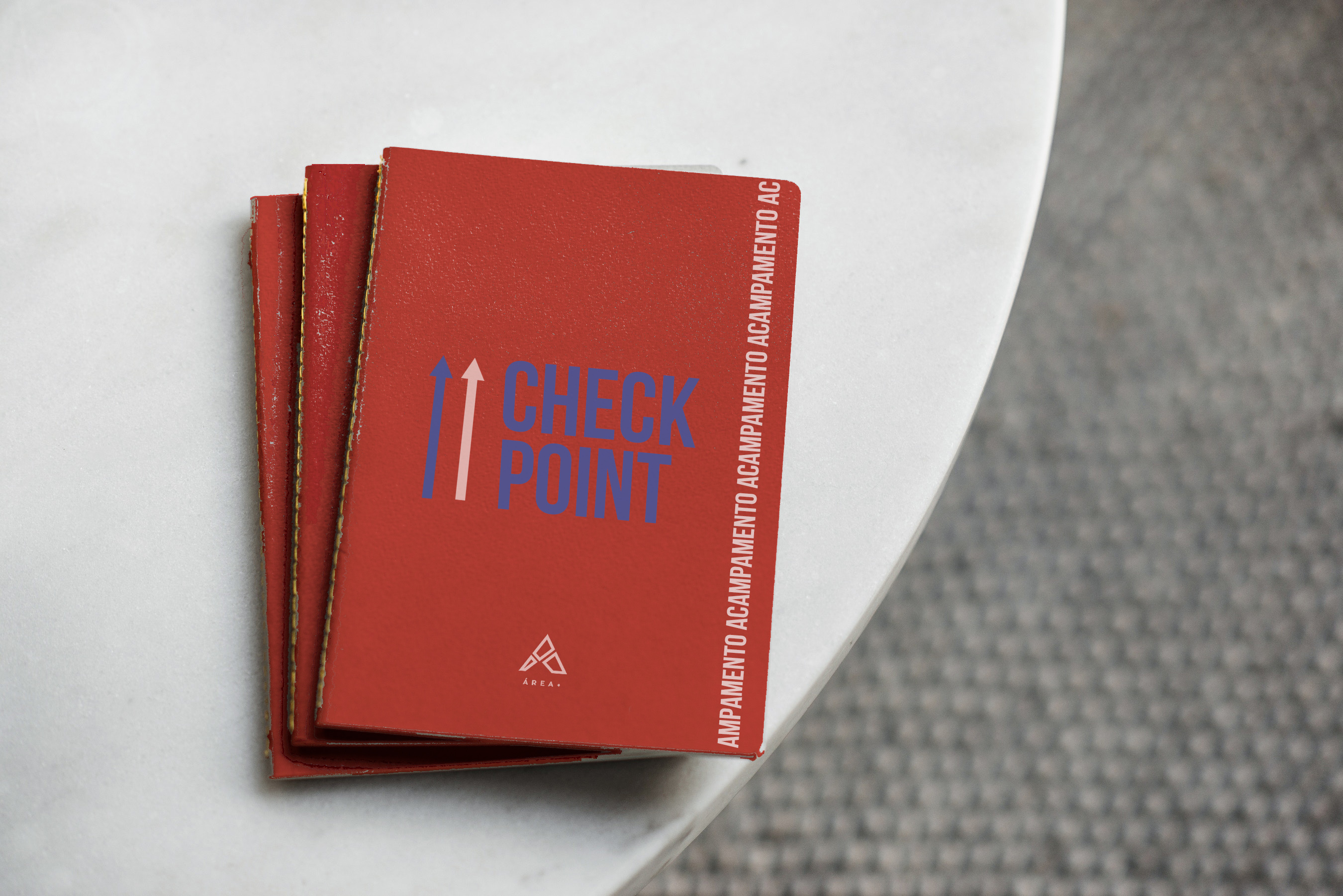
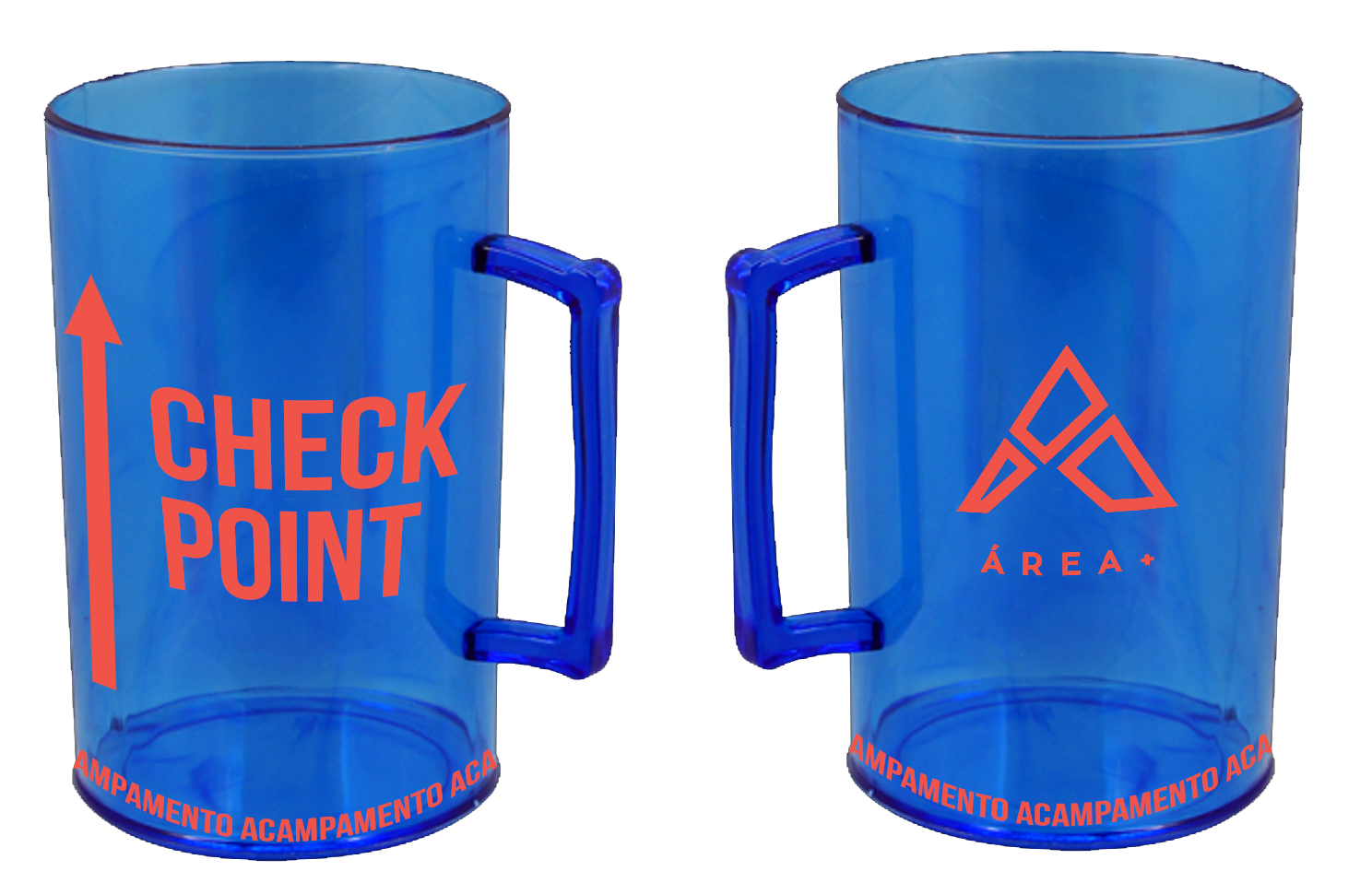
Checkpoint camp
To create the name and visual identity of the checkpoint camp, we used brainstorming sessions with the leadership team. After this, I studied to define the color palette, typography and visual elements and then approved with the team. For the camp several materials were made: for promotion on Instagram, printed materials, notebook, cup, stamps and etc.
About this project
- Client: Área + / Igreja Batista Capital
- Date: August/2019
- Team: Beatriz Rabetti
- Tools: Adobe Illustrator, Adobe Photoshop
- Topics: Graphic design, printed materials, instagram post